Graphic Design / Looptown Logo
Recently, I was asked to design a logo for a local DJ group called LoopTown. Dealing mostly with late teen audiences and house music, I had some fun playing around with styles and symbols that I thought would resonate with that audience. I wanted to create something fresh and distinctive for the group, mixing between simplicity and complexity to create an image they could build a brand on.

Burn the Biscuit - 02 - Lucy
Carrying on from last week, I've been looking forward to sharing this little character. 8-year-old Lucy is one of the main protagonists in Burn the Biscuit. She's the youngest in the family, and adventurous in spirit. Light and agile, she's quick thinking, full of energy, and very focused. Here's a little collection of development for her; including colour studies, a turnaround, and an expression sheet. :)

Burn the Biscuit - 01 - Development Sketches
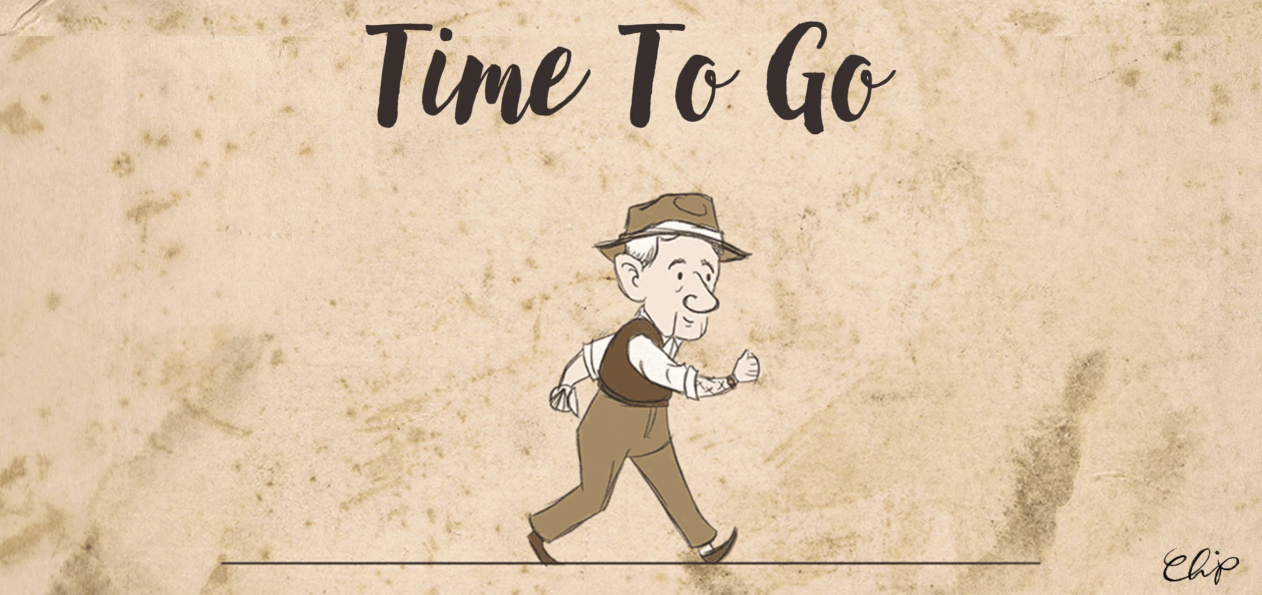
Now that I'm a fourth year animation student, I have two significant projects - amid a sea of smaller ones! - to concentrate on over the next few months. And I'm excited about both! I can't wait to share some of the ideas I've been developing for all of those, but first, I've been wanting to share an older story pitch that I developed last year!

Harley Quinn, and the run up to DCC
I can't believe it's August already. 2016 seems to be rushing past at record pace! It's going to be a crazy busy few weeks though, with a few adventures and projects I've been very excited about for some time now! :)

The Guards - Comic Lettering and Design
Earlier this year, I was invited to join a project that got me excited immediately. The Guards, an independent comic with a brilliant creative team behind it, is finally ready for the release! Act 1 will be launched at Dublin Comic Con this year, and I promise you it's worth picking up a copy! Written by Shane Ormond, with art by Kevin Keane, and working with editor, Colin O'Mahoney; I was delighted to provide comic lettering and design for the book. I think the team did an incredible job, and I am so proud and delighted to have been a part of it.

None Shall Pass - Comic Design and Lettering
I had so much fun with this one! None Shall Pass, created by John Murphy of Bold Puppy and pushed a step further with LS Comics, was of those projects that really makes me fall in love with graphic design all over again. A great team of talented people came together to work on this teaser-version of the book, and I was utterly delighted to have been a part of it. Many thanks to Eoin of LSComics, John of Bold Puppy, Robert Carey, Dee Cunniffe, and Cormac Hughes!

Curiouser and Curiouser | Set Extension Project
Last semester in college, I studied Previz and Comp, and I very much enjoyed it! I don't know quite why I waited so long to share this - I'm delighted with how it turned out! Set extension is an interesting project to undertake; much more common than I ever imagined in the film and TV shows you see every day, and an incredibly satisfying result when it works well. One of my favourite things about this project in particular was being able to combine so much of my own personality and my own adventures into one little scene! I used photographs I had taken from a few of holidays and day trips I've been on, went on a few new shoots, and I even included myself in the scene - all wrapped up in a fantasy, Alice in Wonderland (my namesake, which I absolutely take after!) theme. Can anyone recognize any of the places that feature here?


Little Red
For the past three weeks, I've been kept busy with full time work placement in an animation studio in Dublin. It was fun, I was able to develop my skills, and I met a few wonderful people along the way. I gained so much more from the experience too; discovering what it was like to live and work in the biggest city in Ireland. I'm incredibly thankful to have had that opportunity, but it did take some getting used to... and I was exhausted from it. When I got home, I spent an entire day just sleeping, thinking, writing, and drawing in an effort to get my energy levels back up to usual. So, to kick this blog into its usual routine again, I thought I'd share one of the pieces I did that day, which helped me get back to my usual self again. :)
Two of a Kind | Ruth Butler | May 2016
The latest release from Ruth Butler and I! Two of a Kind is the May installment of our monthly musical adventures, which you can see here! Enjoy!
Preparing for Pen & Pixel 2016
It’s amazing to think that we’ve made it through another academic year already. In LIT Clonmel, that means a few things: it’s deadline season, it’s exam season, and it’s almost time for the annual Pen & Pixel exhibition!


Zippo Advert - Update 01 - The Pitch
One of our assignments in college this semester is to create a 30-second advert for a product of our choice. I picked Zippo lighters; mostly because the product itself is pretty cool, so I found it easy to come up with an strong, visually dynamic idea which would sum up the product well. I'm having a lot of fun with it, and it's starting to come together now, so I figured I might as well start sharing the process involved in it as I make progress. Here's step one: The Pitch! ...Which, in this case, also includes styleframes and the storyboard.


The Chicken Song | Ruth Butler | March 2016
It's been a long time coming, but The Chicken Song is finally here! Ruth Butler and I have been working on this project for a few months now, and we're both incredibly excited to be able to share it! Ruth, always a treasure trove of ideas, developed the story and song, while I've been busy developing the visuals and animation. The journey has been a fun-filled one, so do please press play, check it out, and subscribe to Ruth's YouTube channel or my Facebook Page or other social accounts to keep up-to-date on our musical adventures! And be sure to have a very happy Easter too!
Self Portrait
For some time now, I've been thinking about my little pocket watch logo, wondering whether or not I should update that as my icon across social media. I had a few good brainstorming conversations too, which made me wonder if it was time to start using something digital, something more characterful, and/or something closer to a visual representative of me as an artist. With all that in mind, I decided to draw up this little stylised version of myself as a character. I'm not 100% sure that I'll use it as planned (I'm pretty attached to my pocket watch!) but it was a fun little experiment all the same. :)