Lettering / A Study in Scarlet

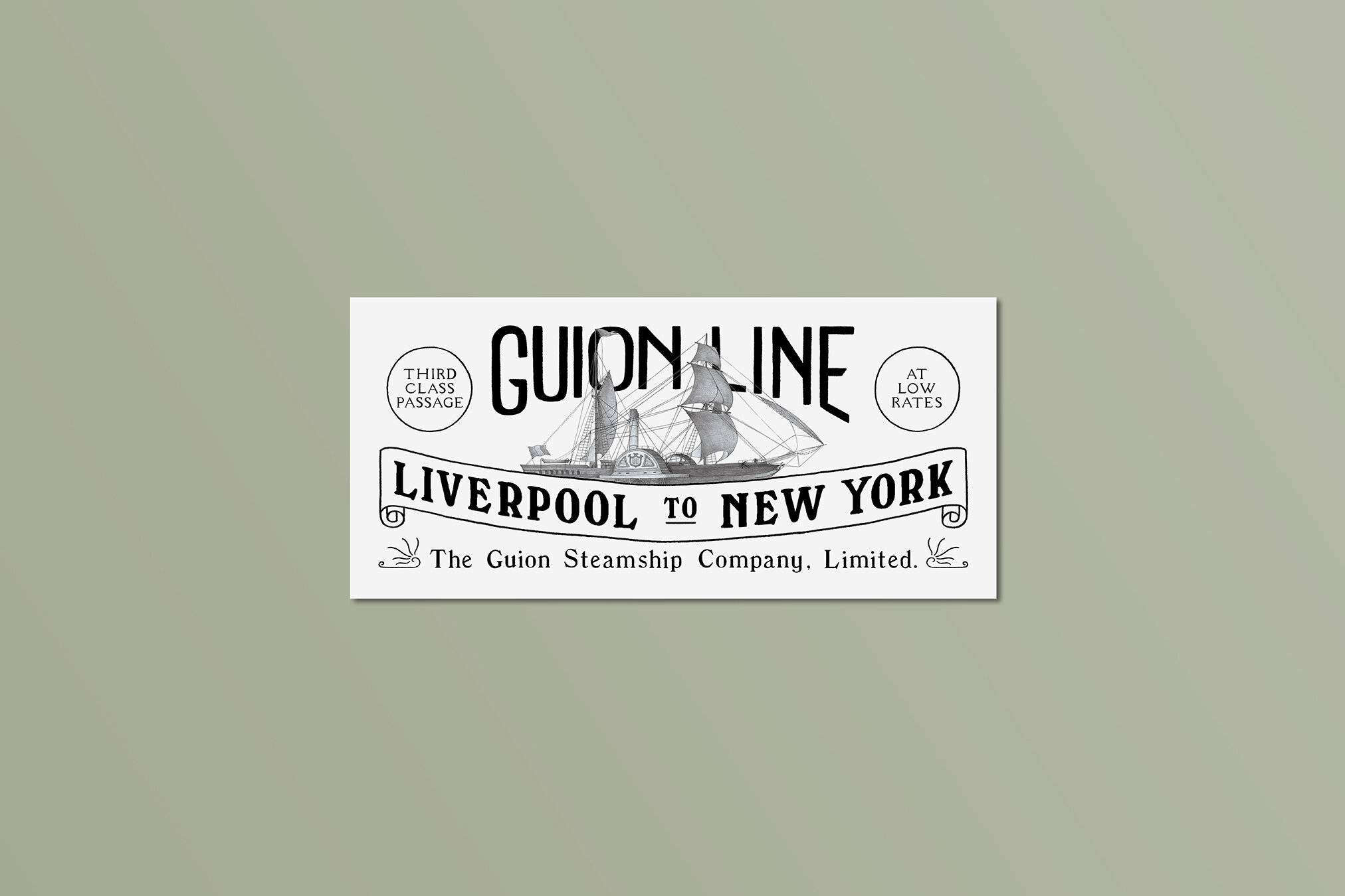
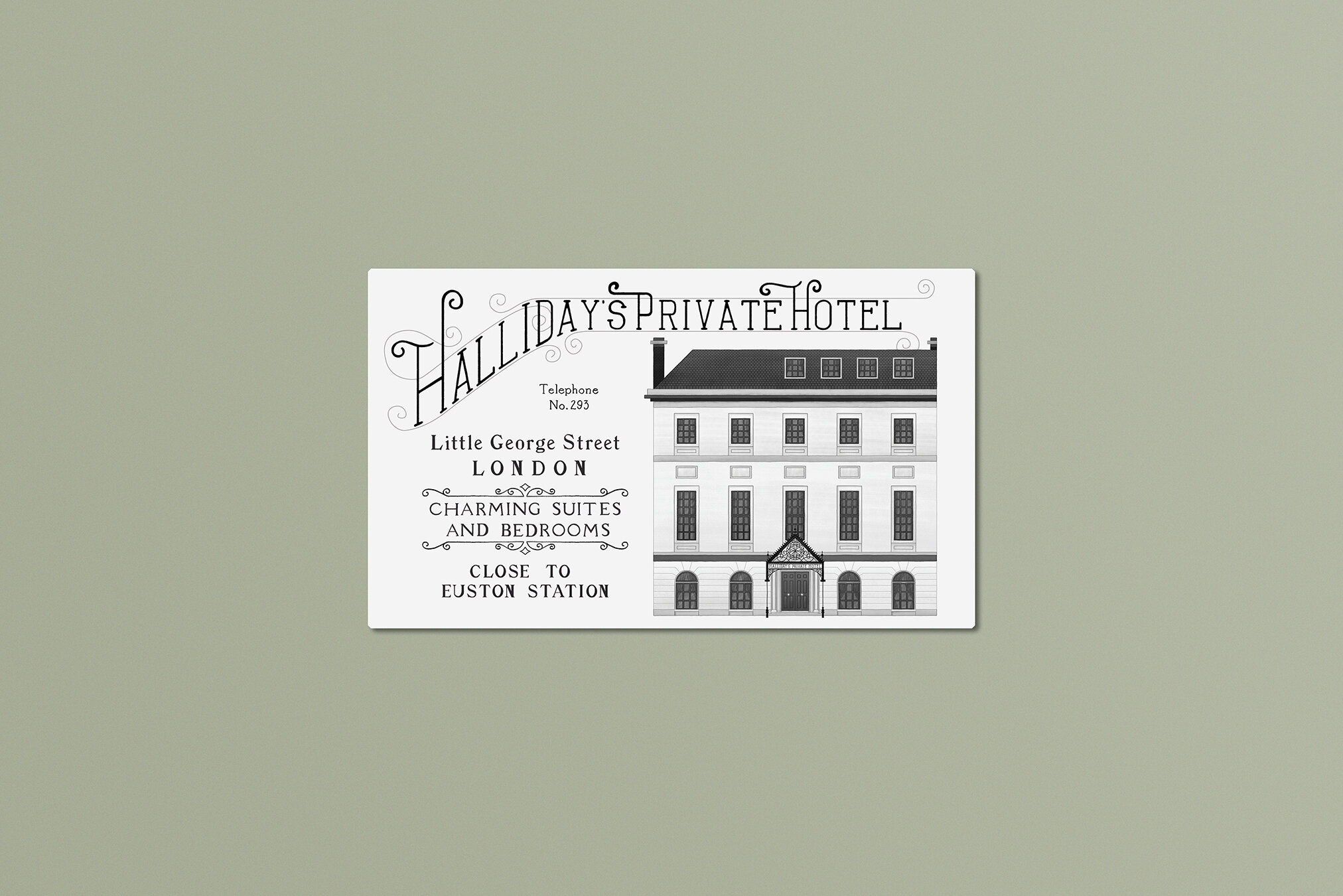
One of the most interesting - and most time-consuming! - parts of my Study in Scarlet project was the lettering in all the adverts. Everything is based very heavily on historical advertising references from the early 1900s (I really love that kind of research!) and I ended up drawing pretty much every letter by hand. There are so many delightful quirks in that vintage typography, and I really wanted to capture as many of those characterful details as possible!
Some of my very favourite details in the whole project include:
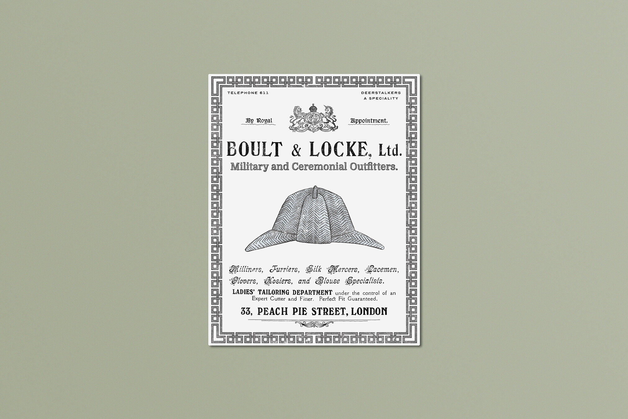
The pretty little flourishes in the capital letters listing all the skills and specialities of the Military and Ceremonial Outfitters.
The sheer mixture of typefaces working together in all of these ads! Modern day design most often uses just one or two typefaces in tandem, but in the early 1900s, they might use half a dozen or more at once! It’s chaos, and I love it.
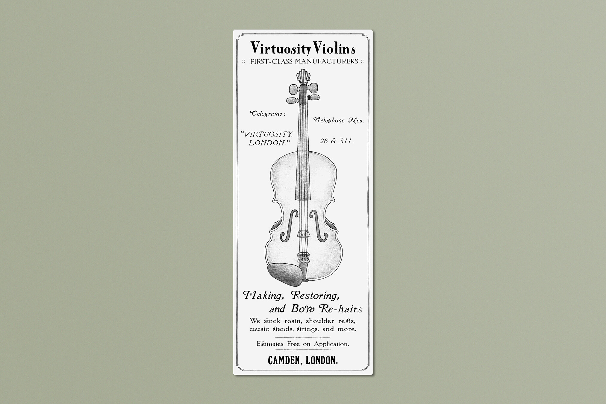
The “st” ligatures in the Violin advert! Such a sweet little detail. I also love the bouncy lowercase w in “Bow” and the little flourishes in “Telegrams” and “Telephone”. I also love that telephone numbers were generally an incredible three digits long, if even!
All the little decorative flourishes! They couldn’t rely on photographs and bright colours to grab attention, and I love all the artful swirls and graphics they used instead.
All in all, I love details like this because they can help tell the viewer so much about the world that a story is set in. Before you read so much as a single word, you can tell pretty easily when and where the story might take you, and one of my very favourite things about being a designer / illustrator is being able to support stories in immersive ways like that. :)