Lettering / Handwriting Studies
I’ve picked up plenty of odd hobbies and fascinations during lockdown, and penmanship is one of them. I was at a virtual class late last year and the designer mentioned Shakespeare’s handwriting, which sparked my curiosity. I ended up falling down a rabbit hole exploring the handwriting and signatures of historical figures, taking an interest in all the little quirks that can reveal a lot about someone’s character. Long story short: here’s a handful of quotes I liked, in handwriting I found interesting. (This isn’t a serious project btw; just a fun little dalliance through history via handwriting. So these are more approximations than exact replicas of each handwriting style.)

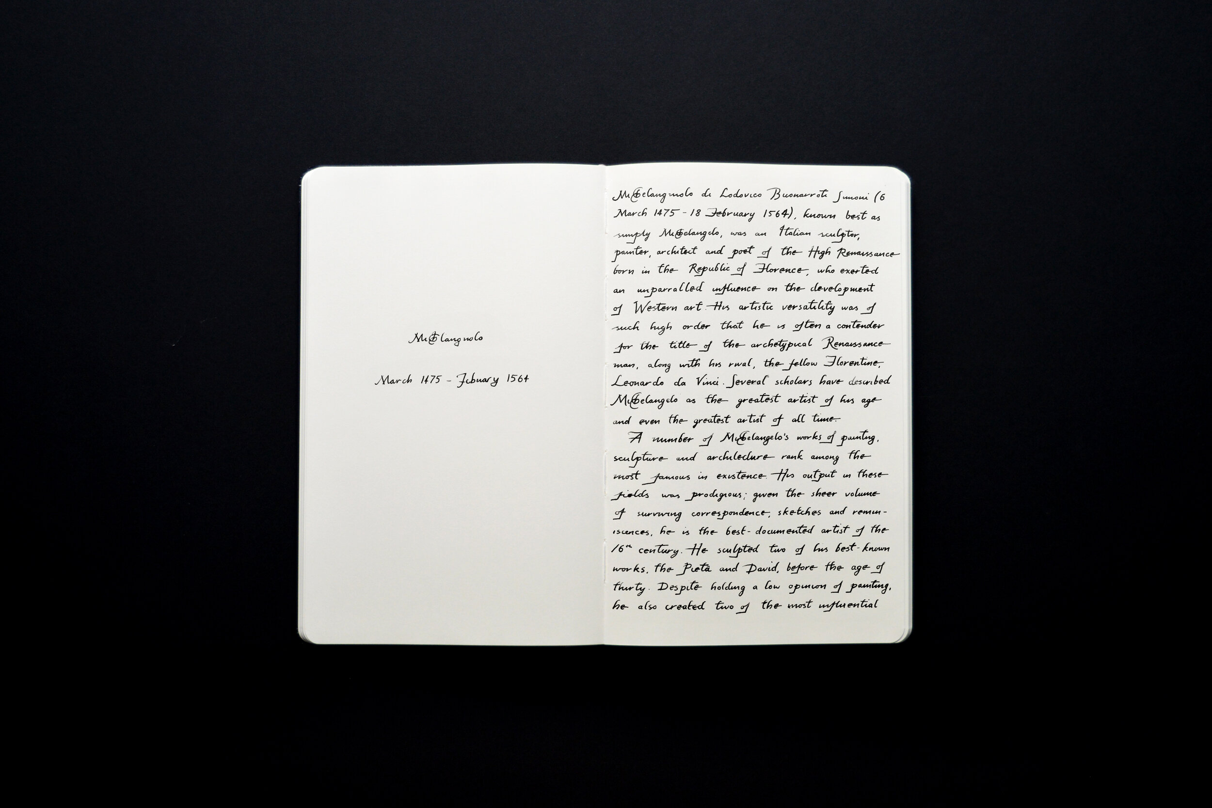
Michelangelo
“If people knew how hard I had to work to gain my mastery, it would not seem so wonderful at all.”
1475 - 1564
-
My favourite thing about Michelangelo’s script are those unusual little lowercase ‘e’s, and all those very angular descenders. Also, who would’ve thought one of the most prestigious artists of all time would be so humble?

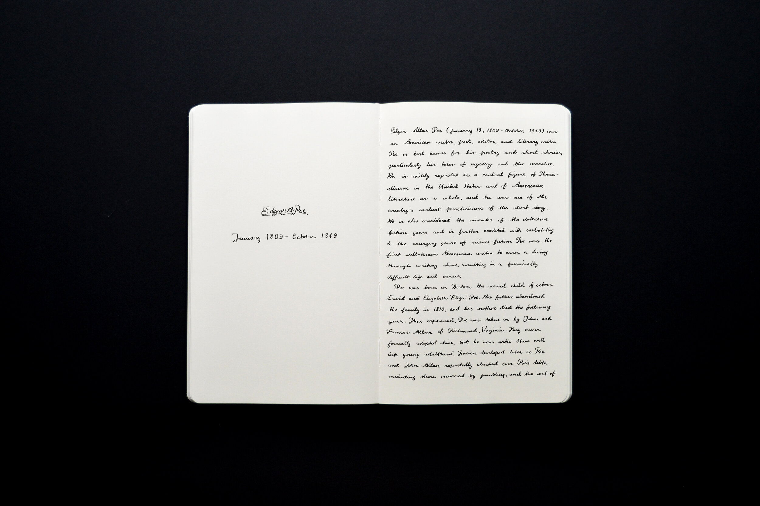
Edgar Allan Poe
“All that we see and seem is but a dream within a dream.”
1809 - 1849
-
Edgar Allan Poe had quite a rapid handwriting style, featuring a lot of fancy flourishes in his capital letters. One of the most unusual features of his writing is that he joined his lower case ‘t’s using the crossbar, rather than the stem.

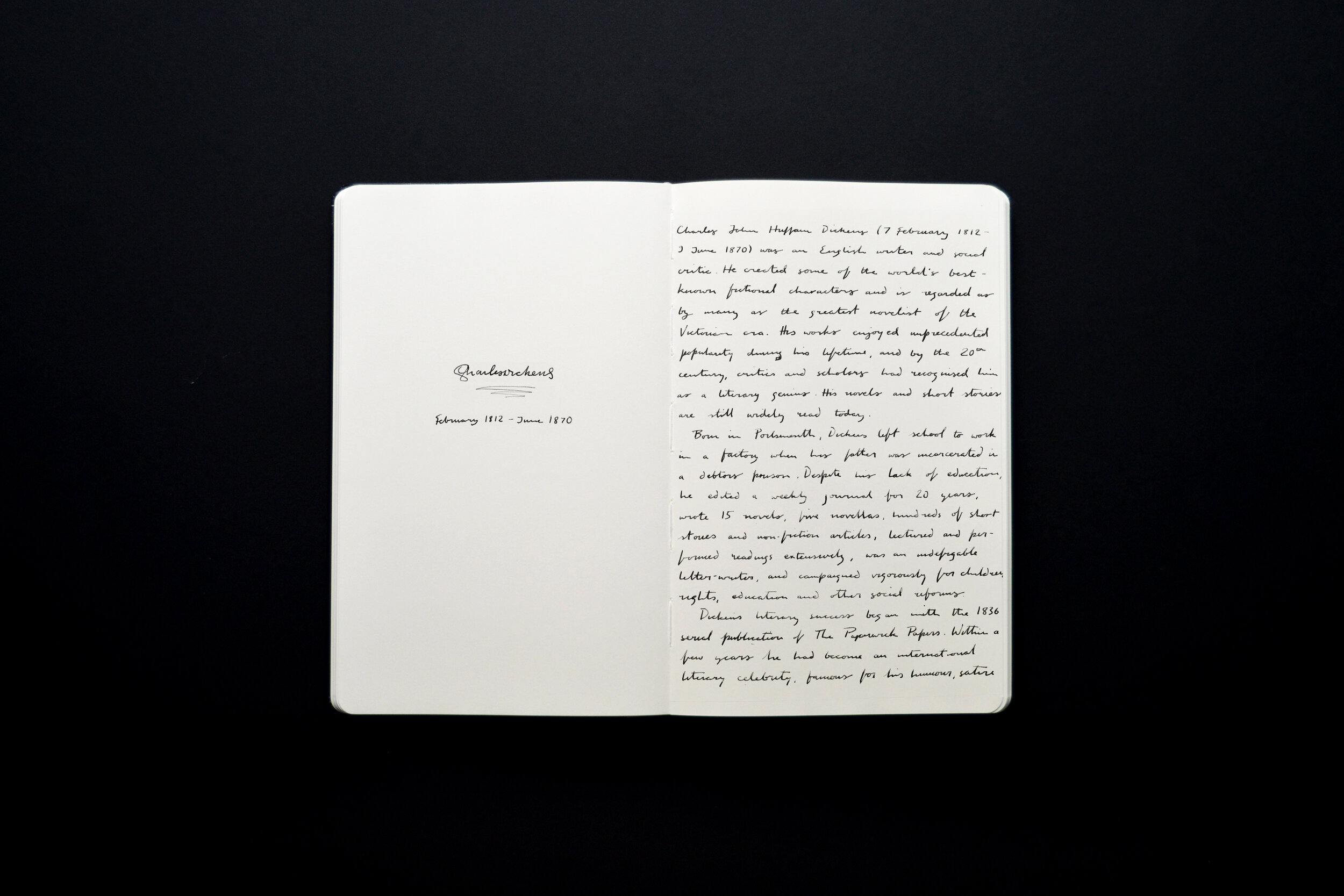
Charles Dickens
“It was one of those March days when the sun shines hot and the wind blows cold: when it is summer in the light and winter in the shade.”
1812 - 1870
-
Charles Dickens was a very prolific writer, and his script suggests he wrote everything quickly. It’s pretty careless and not always easy to read, as though his hand was always struggling to keep up with his thoughts. Some unusual features include lowercase ‘g’s that barely form a bowl, and very sharp lowercase ‘f’s especially evident whenever the word ‘of’ crops up.

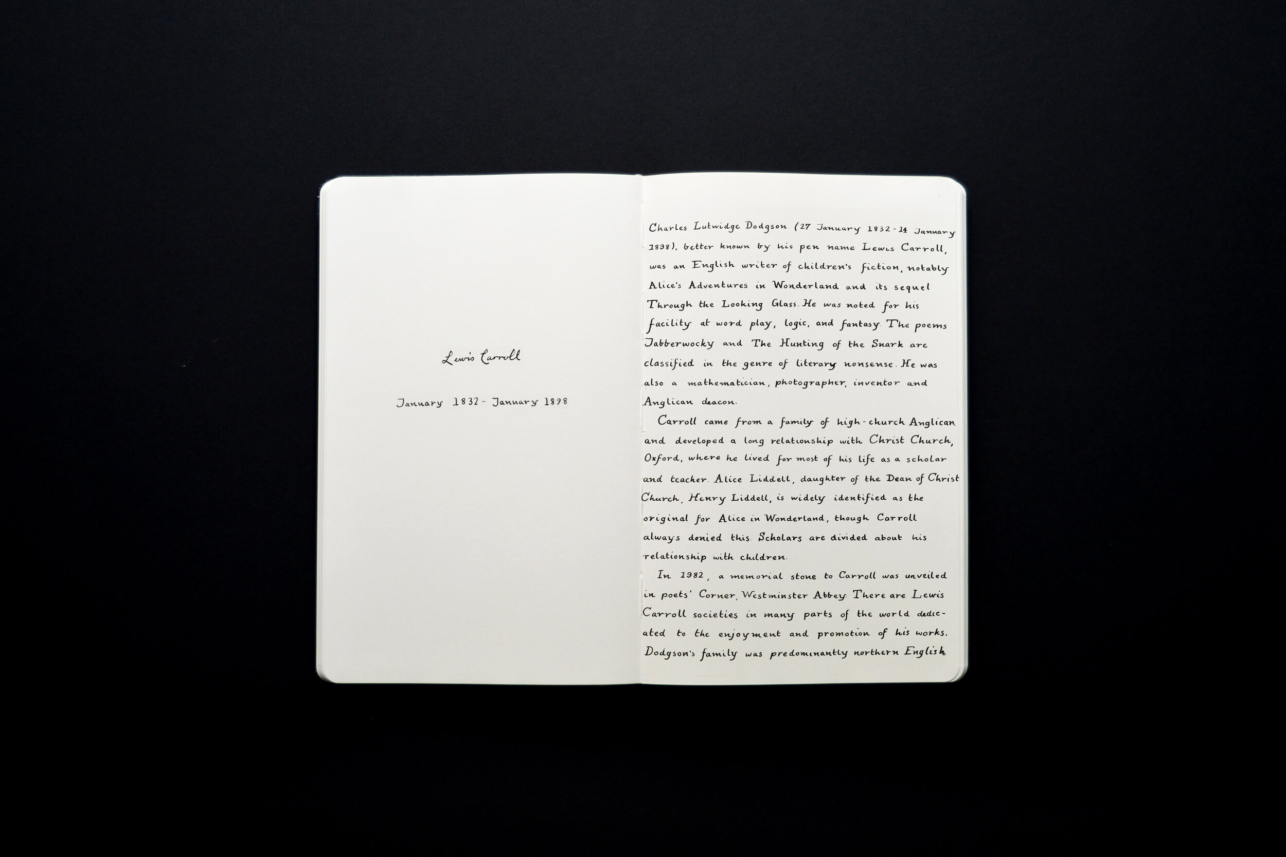
Lewis Carroll
“It’s no use going back to yesterday because I was a different person then.”
1832 - 1898
-
Carroll was extraordinarily careful and considered in his handwriting, as though he was making his writing as easy as possible for children to read (which makes sense, for Alice’s Adventures in Wonderland). His uppercase letters usually included serifs, and his lowercase letters were disconnected cursive. It’s defintely not a fast-paced writing style.
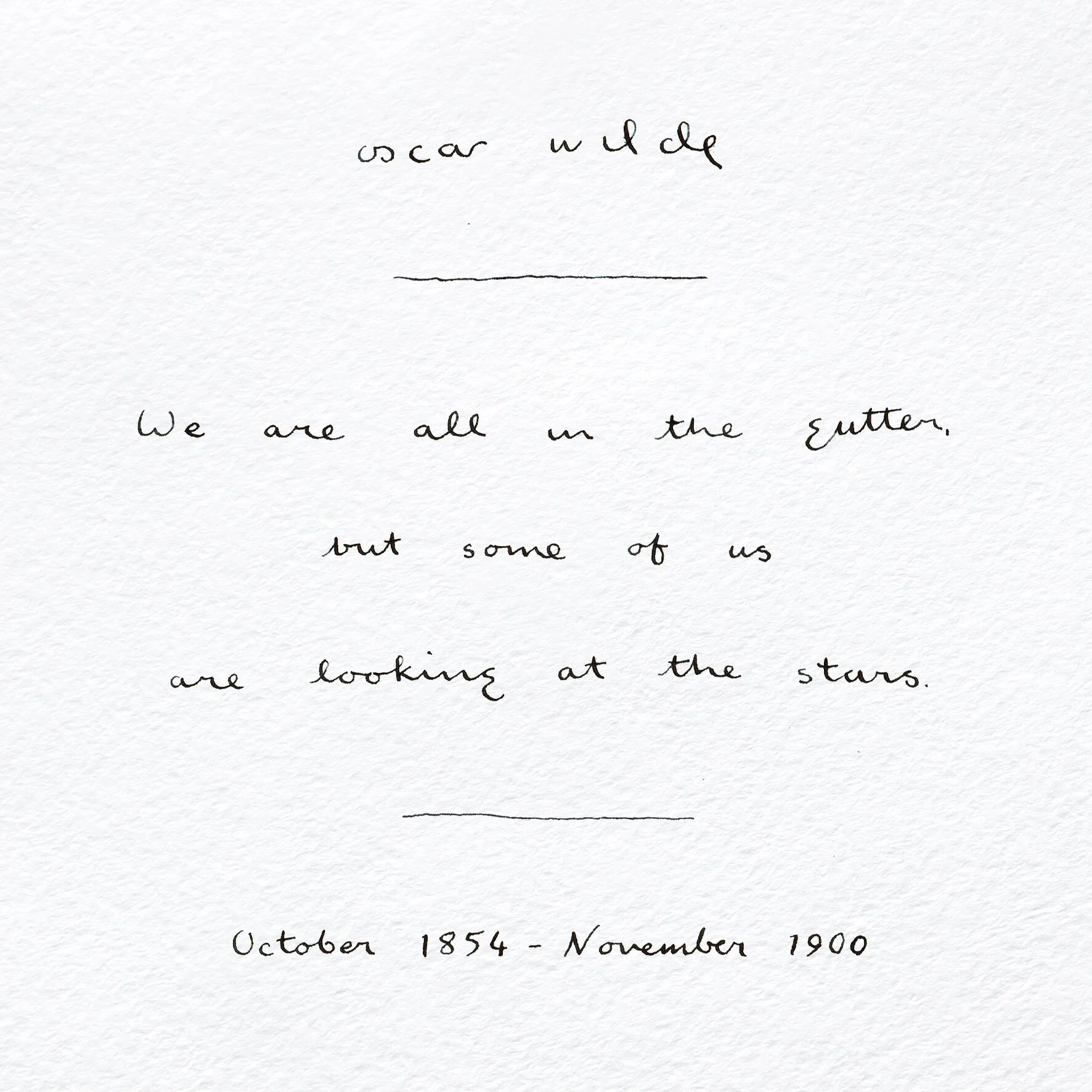
Oscar Wilde
“We are all in the gutter, but some of us are looking at the stars.”
1854 - 1900
-
Wilde had an incredibly light touch with his script, resulting in a very lightweight writing style. It’s very broadly spaced, like his thoughts were always running on ahead and he was trying to catch up. I love the soft curves of it, and especially those gentle lowercase ‘g’s.

Sir Arthur Conan Doyle
“When you have eliminated all which is impossible, then whatever remains, however improbable, must be the truth.”
1859 - 1930
-
Doyle had a pretty sharp and angular style, especially in those lowercase ‘p’s. It’s a fast-paced scrawl, with barely-there lowercase ‘r’s, and almost no flourishes. It’s not always easy to read, which seems appropriate considering he was a trained doctor himself, and I’m sure we’ve all struggled to read a doctor’s script at some point or other!

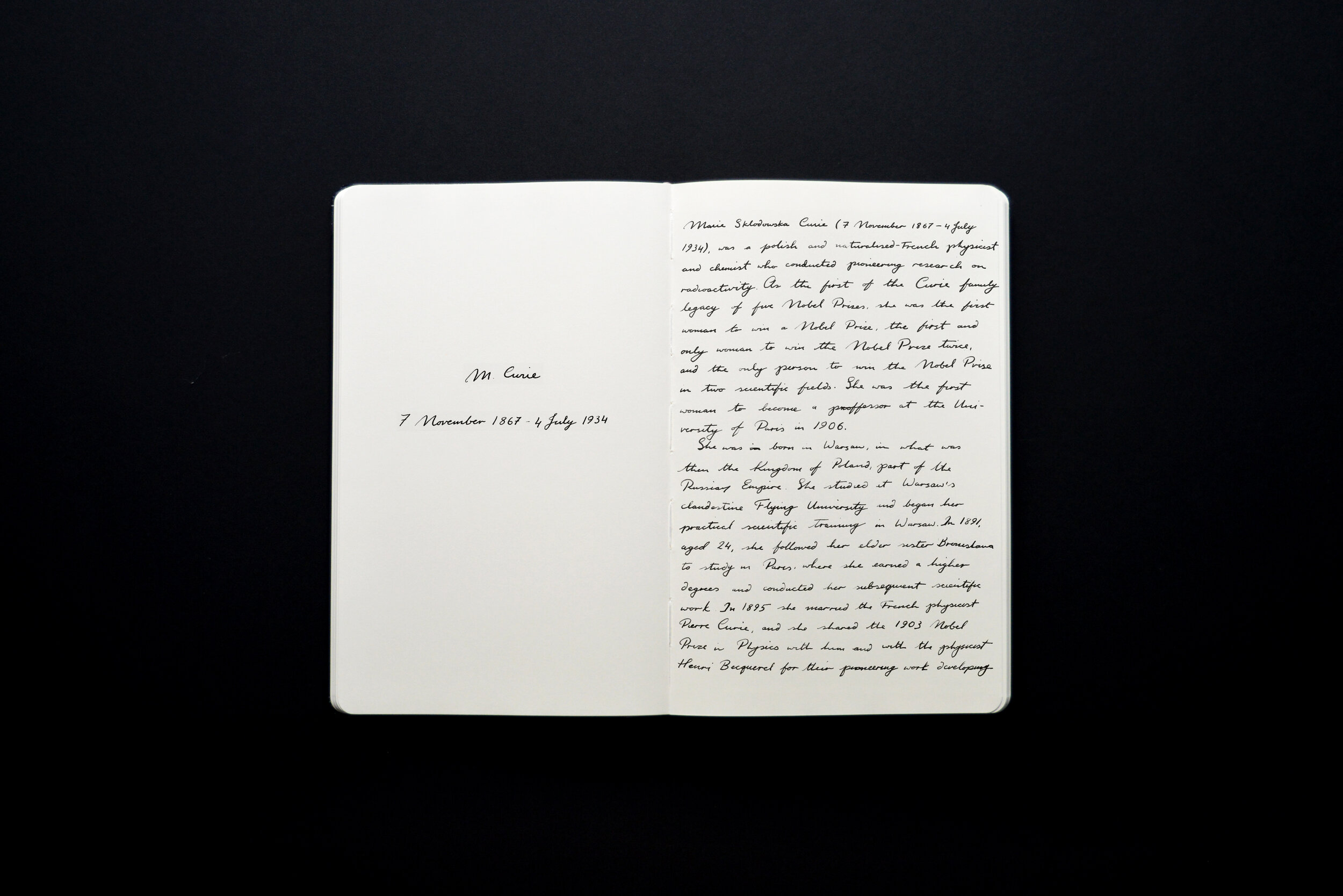
Marie Curie
“Nothing in life is to be feared, it is only to be understood. Now is the time to understand more so that we may fear less.”
1867 - 1934
-
I assume Marie Curie signed her first name with just an initial because she was working at a time when women weren’t well respected in her field. Either way, I think her elegant, italic script is quite beautiful, and I love all those graceful curves. Fun fact: her notebooks - even her cookbooks! - are still considered too radioactive to handle, and are stored in lead-lined boxes even today.

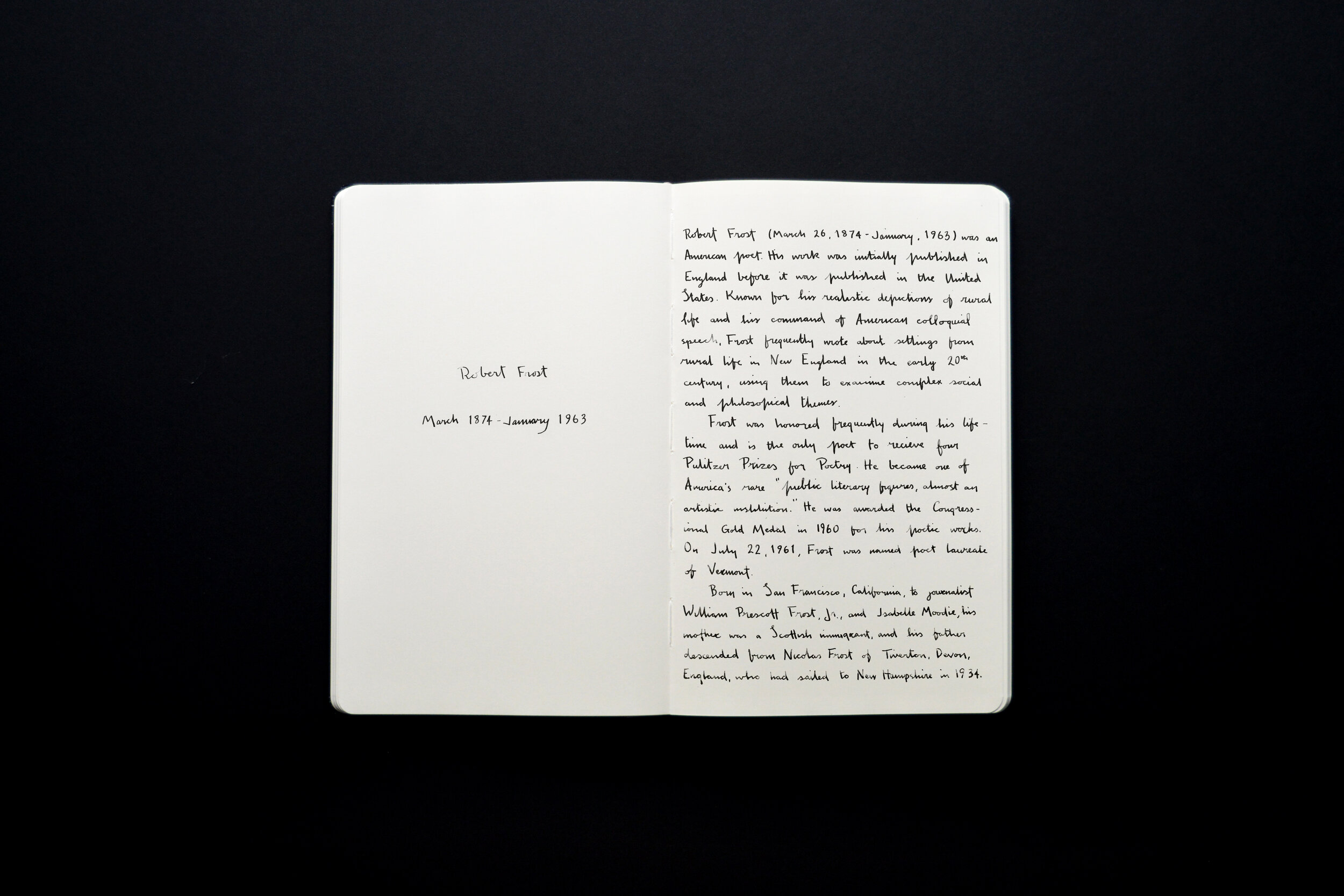
Robert Frost
“In three words I can sum up everything I’ve learned about life: it goes on.”
1874 - 1963
-
One of the sharpest writing styles I’ve come across. Frost was decisive with every stroke, and seems to have put a lot of emphasis on downward strokes in particular. Those capital ‘I’s are one of the more interesting features of it.

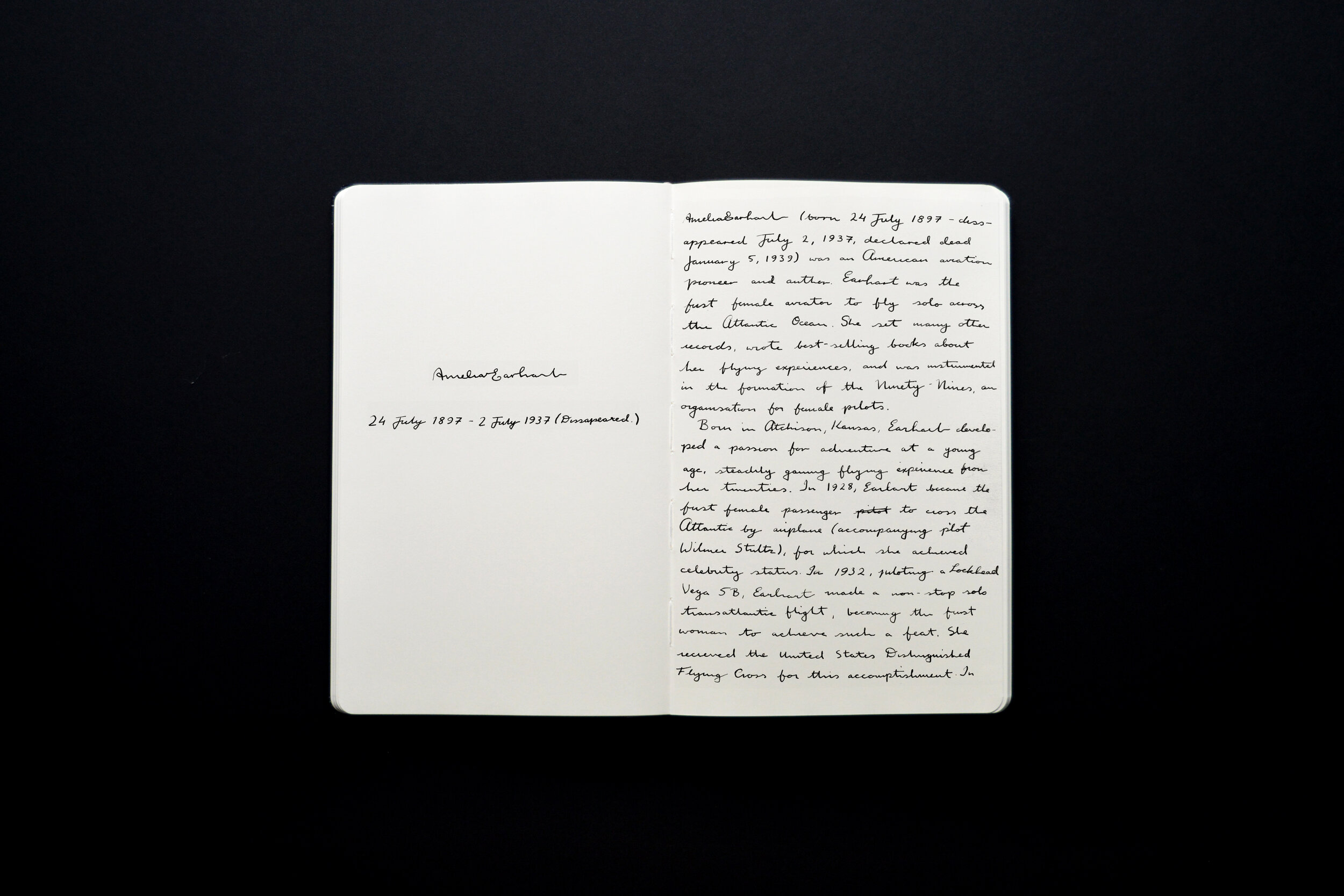
Amelia Earhart
“Adventure is worthwhile in itself.”
1897 - 1937
-
I really like Earhart’s gentle, feminine script. She seemed to have a pretty light touch, and her style is a lovely mix of subtle flourishes and rapid pacing (evident in things like the crossbars of lowercase ‘t’s running long, or appearing beyond the stem of the ‘t’ entirely). I like to think it suggests she was considerate, and that she wasn’t going to hang about dawdling.

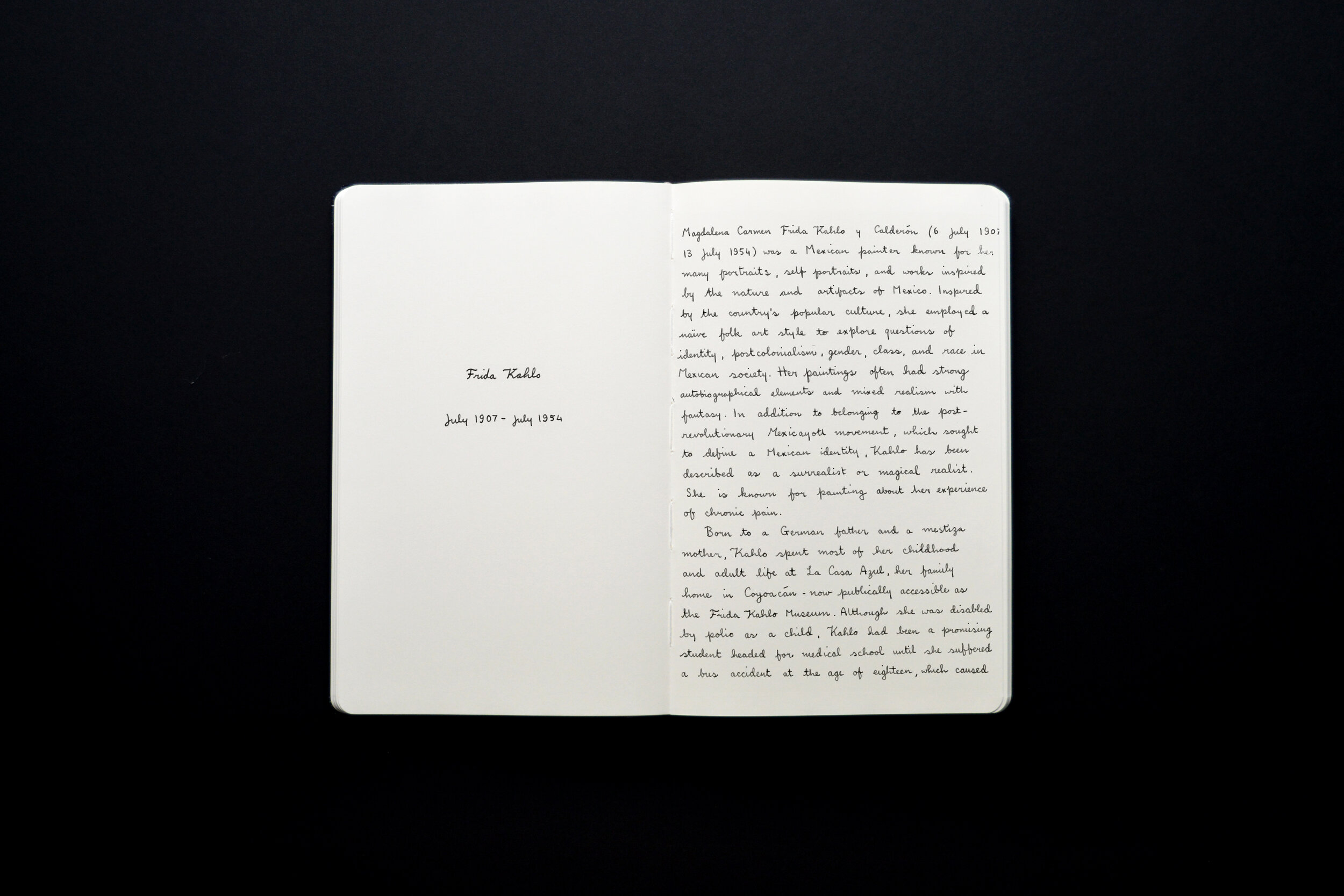
Frida Kahlo
“At the end of the day we can endure much more than we think we can.”
1907 - 1954
-
To finish; the gentle flowing loops and quite contemporary-looking cursive of Frida Kahlo, with words that seem apt for current circumstances. This pandemic has been tough on so many people in so many ways, but it is temporary, even if it doesn’t feel that way. We got this.